Flora Finder
Digital Design
Brief
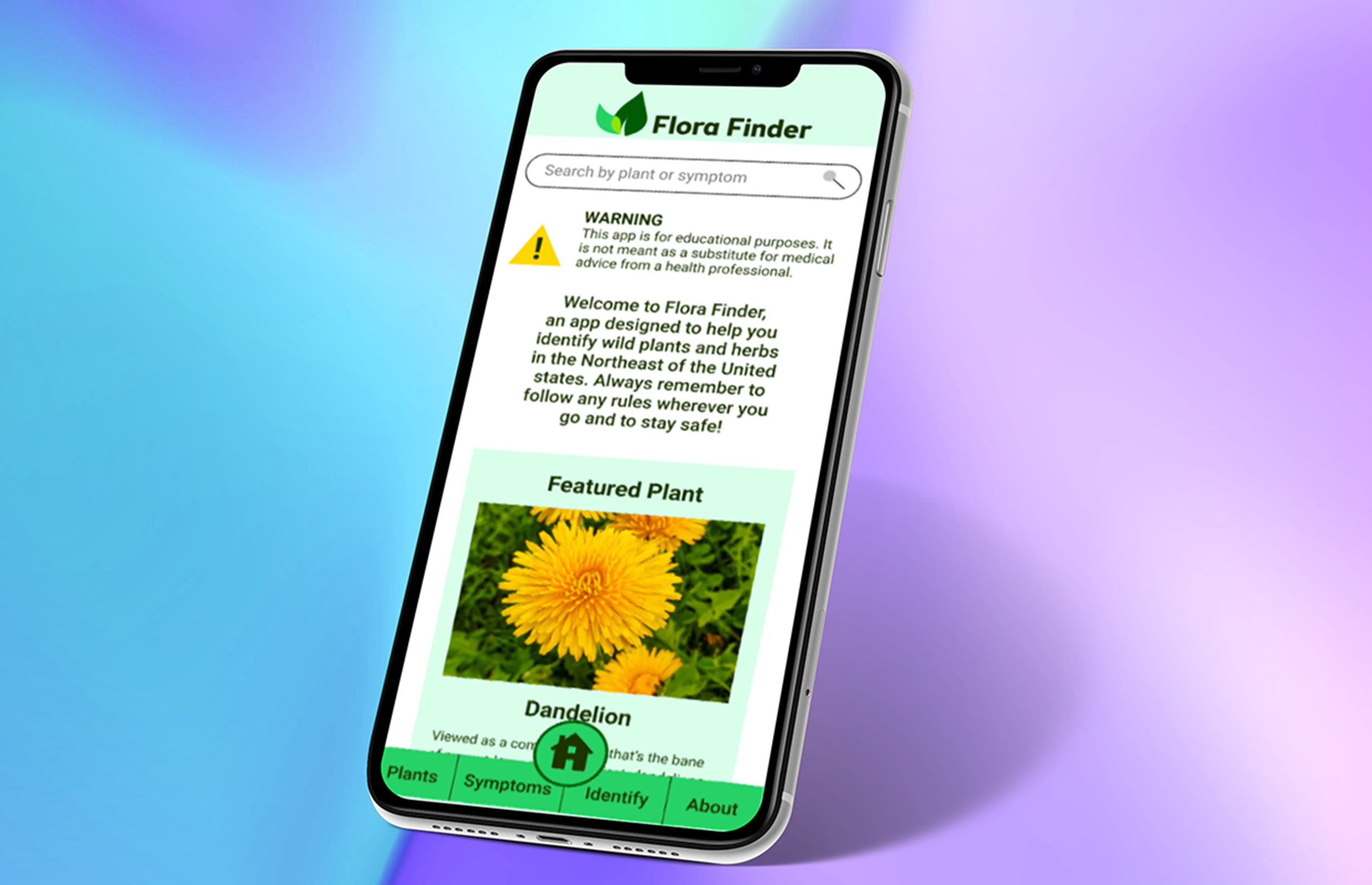
An identification app for plants and herbs that are indigenous in the Northeastern part of the United States. It comes with pictures and medicinal properties of each plant that are native to the region. In addition, there are tidbits about folklore surrounding the plant as well as medicine interactions. In addition, a questionnaire based identification guide is planned as well.
Research
For research, several methods were used to make the optimal amount of data points. Competitive research on apps that treaded similar territory was considered, as well as data collected from user surveys and 1-on-1 interviews. Ultimately, users wanted to have a sense of confidence in the app as well as pictures so they could readily identify a plant when foraging or hiking. Users also wanted additional features such as beauty usage and recommendations of where to go forage that could be rolled out in consequent updates of the app.
Research Phase - Competitive research
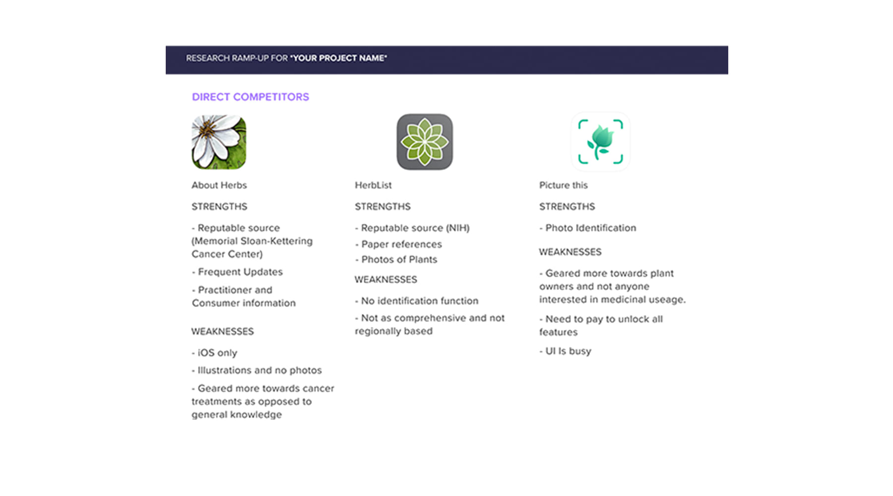
This is an example of some of the research used in building up consequent personas and flows for the app. In this image, a comparison of direct competition is made with both their strengths and weaknesses. It gives a better indication as to what has been done that works, what doesn't work, and gaps where a need can be filled.
Synthesis of Data
All together the data collected painted a picture in which development of the app could go. A roadmap and a persona created using the data from the research phase. A rough wireframe and an app flow were also created to help aid in the creation of the app to ensure that that the initial features were not only ones users were looking for, but also were easy to navigate and understand.

Synthesis Phase - Persona + Empathy map
A persona is created based on the data from all the research, from interviews, surveys, analysis of competitors, and other methods. Having a tangible "person" with their own demographical information helps with development of the app. To supplement this, a empathy map reflecting the personas likes, dislikes, etc. helps to bring the persona more to life and lets the designer empathize more with the users.
Synthesis Phase - User + Task flows
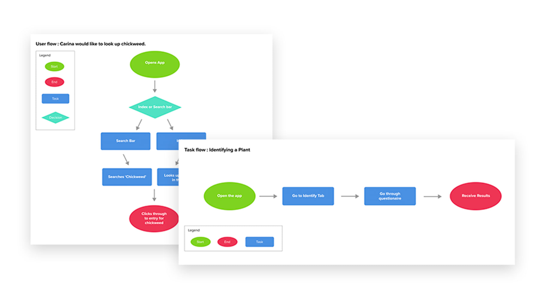
Pictured above is an example of both a user and task flow. While the user flow is more specific and highlights a singular complex task, the task flow is at a higher level. In this case the user flow has the persona searching for a certain specific plant with the different choices that go into it. The task flow on the other hand is a more straightforward map to a simpler task.
Implementation
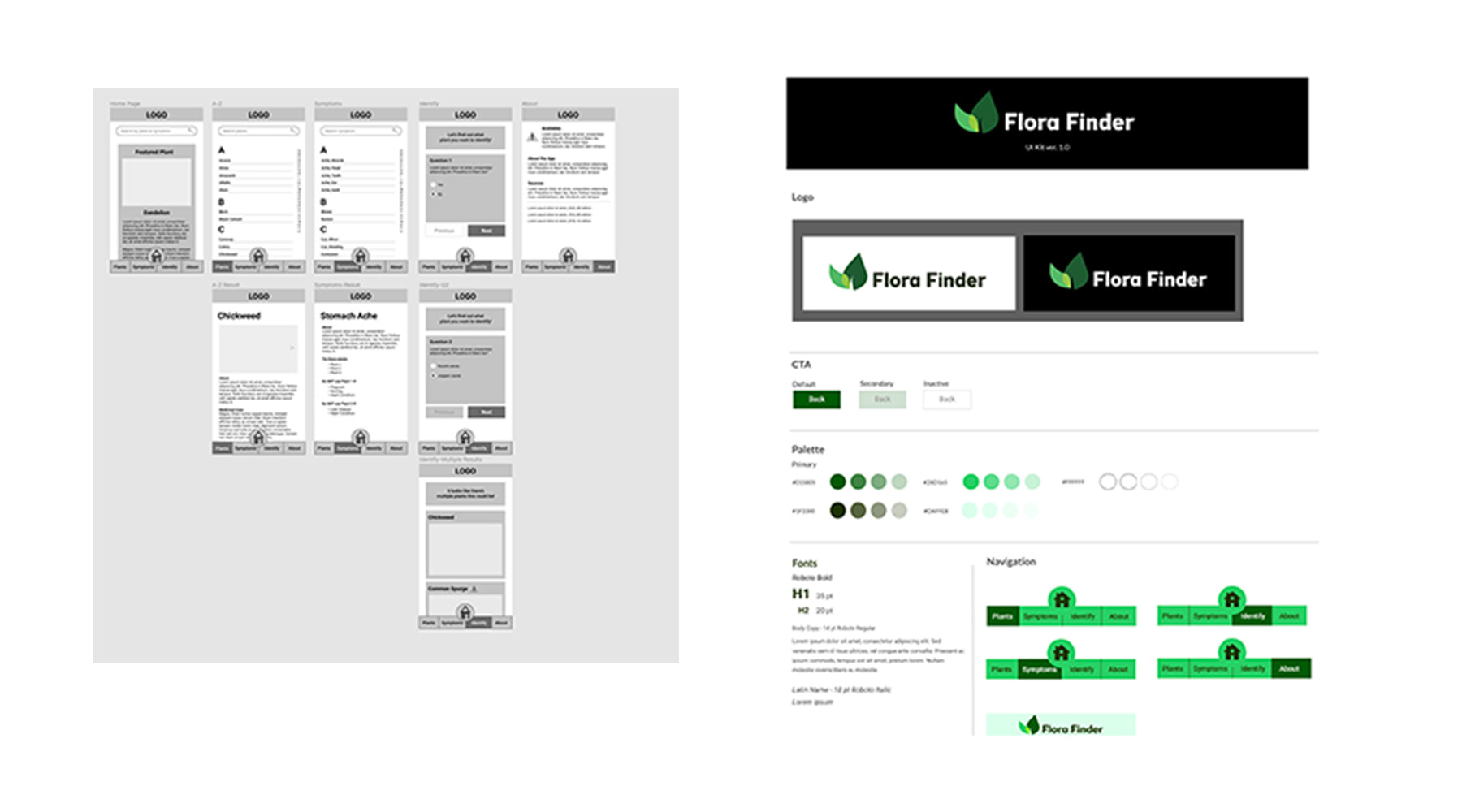
Because this app was built from the ground up, a UI Kit as well as a logo had to be created. From there the wire frames were fleshed out into a high-fidelity prototype. During the implementation phase, more consideration was given to the initial app flow and adjustments and changes were made to reflect it.
Implementation Phase - Wireframes + UI Kit
Based on the previous steps, an initial low-fidelity wireframe was created with just the bare basics. Using the flows and research, more is added until a cohesive app map/wireframe is built. Once that's completed, a UI kit is created, to put a style and look to the wireframe for when it moves on to the high-fidelity and testing phase.


Prototype Phase
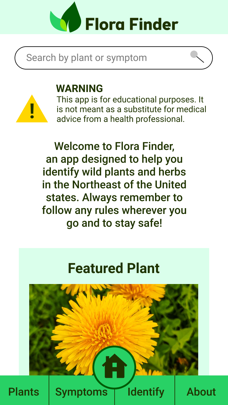
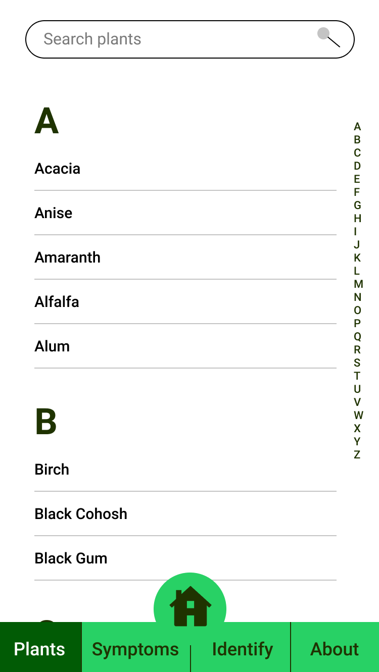
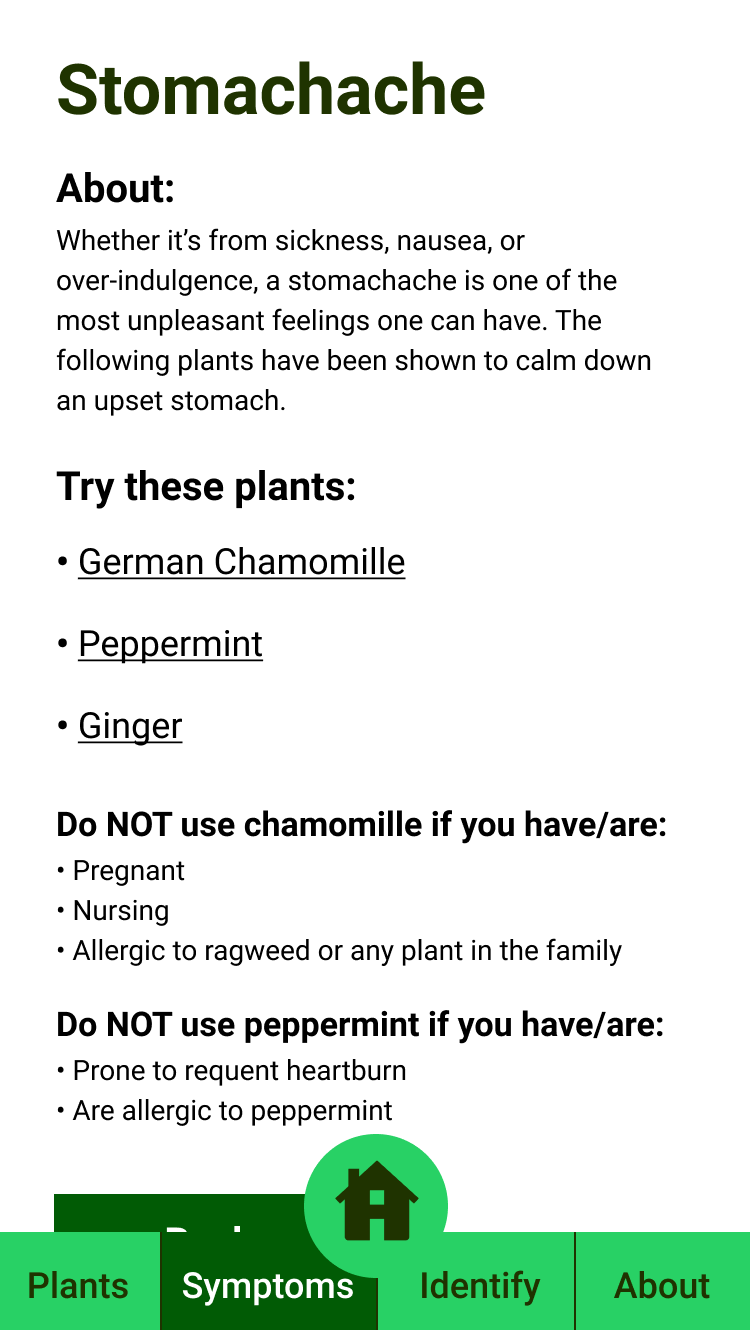
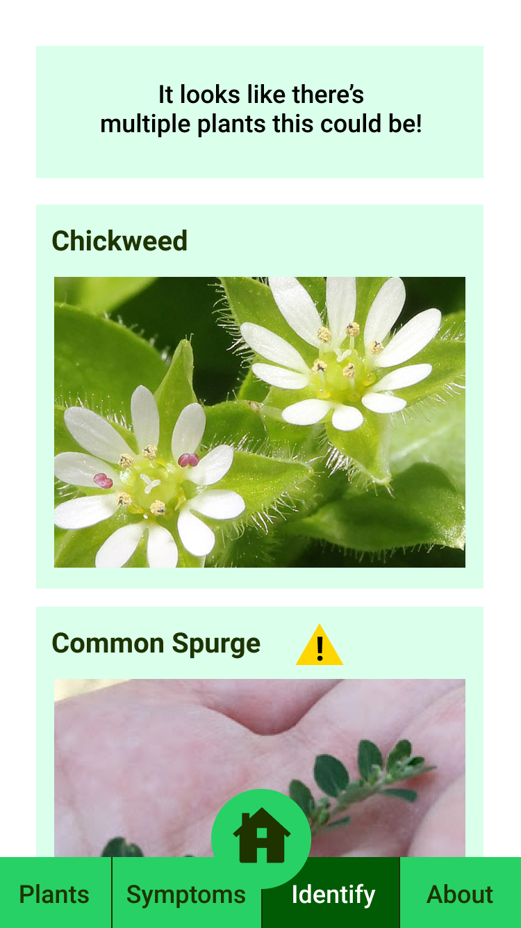
In the making of the prototype, based on feedback from research, several sections were added for a robust app that filled a niche in the app market. First was an encyclopedia of different plants from A-Z that included information such as about the plant, alternate names, etc. In addition, an encyclopedia of symptoms was added so someone could look up symptoms and information on what plants could be used to use to treat them as well as warnings about their use. Another feature included was an identifier. By answering several questions, the user can identify a plant as well as poisonous look alikes. Finally, because of the nature of the app and legal ramifications, a disclaimer and about section was also included as well as a citation of sources that the information was taken from.
Testing
Utilizing a testing website, a series of tasks were created to be completed in succession by a user utilizing a high-fidelity version of the app. Ten anonymous online users, identified only by their gender and age, completed the tasks at an 80% completion rate overall. Pain points included some of the prototype functionality and human error in the wording of the tasks. Overall, users who completed the tasks were satisfied with the experience.
Next Steps
The next steps for this project would be fleshing it out more and building a complete minimum viable product, after which more testing could be done with more robust and complicated tasks. And with the results of the testing more finessing of the app could be made before being passed off to a developer.
