Bittersweet Kitchen
Digital Design
Brief
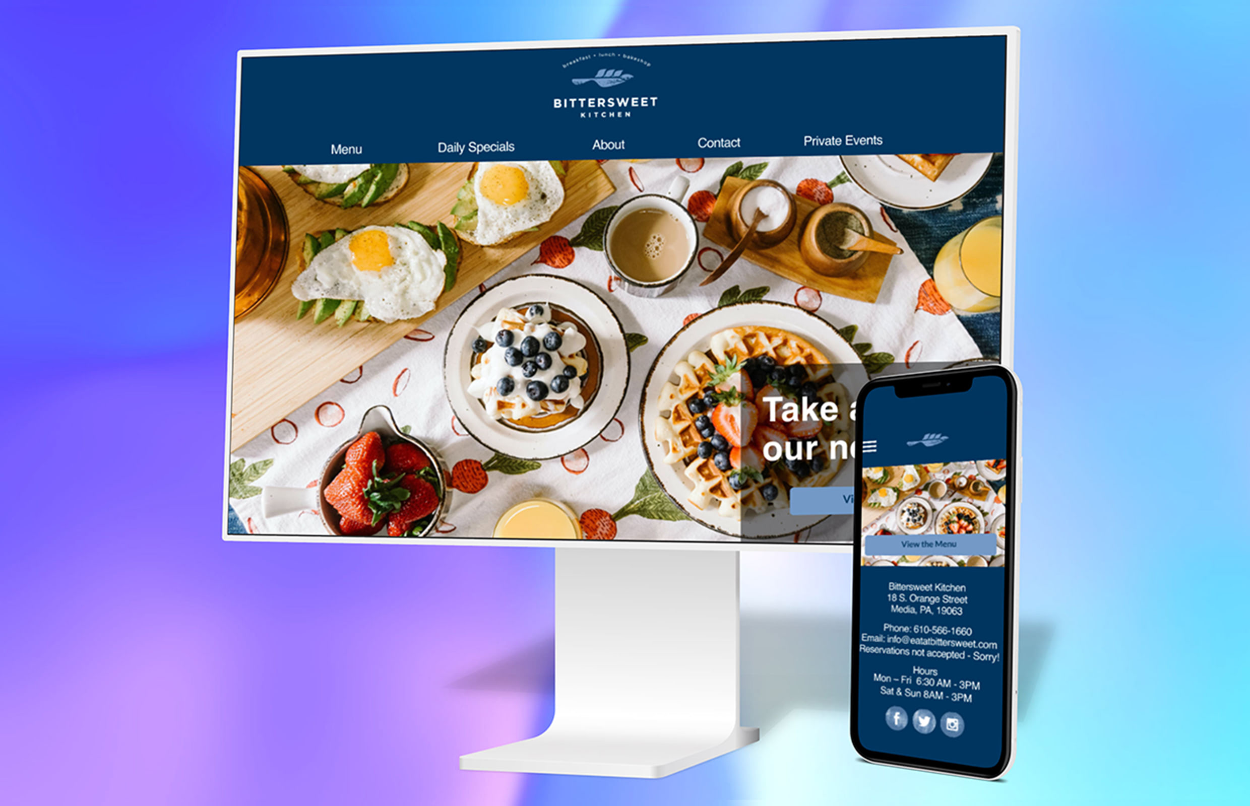
A revamp of a local restaurant’s website to entice more customers and compete against competitors. It needed to be responsive to meet the needs of the customers who would potentially use it.
Research
Competitive research, surveys, and marketing research were among the methods used to build the foundational knowledge needed to be able to put together a cohesive and ultimately beneficial website. It had to be clean and easy to navigate as well as enticing visually to the customer.
Research Phase - Competitive research
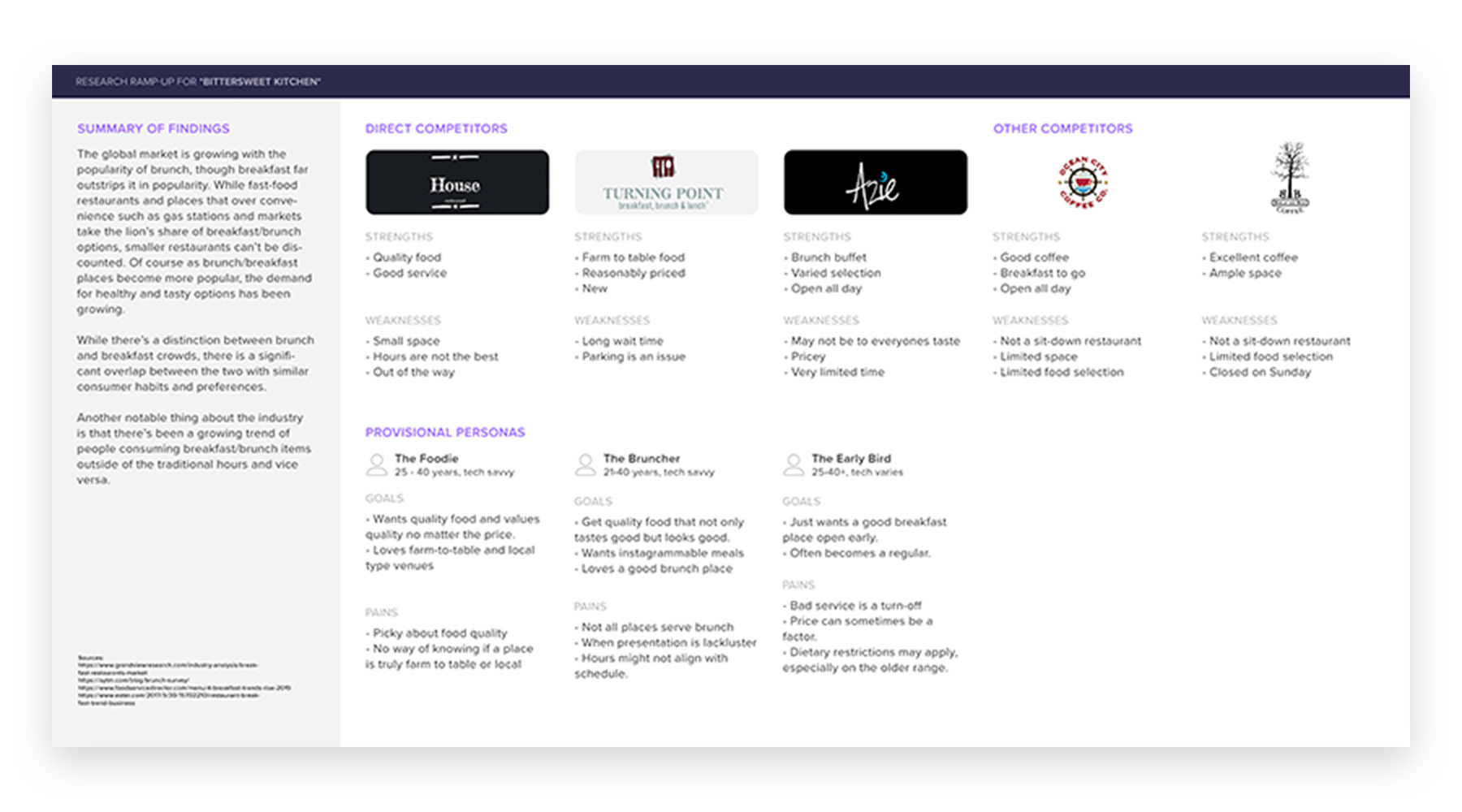
This is an example of some of the research used in building up consequent personas and flows for the app. In this image, a comparison of direct and indirect competition is made with both their strengths and weaknesses. It gives a better indication as to what has been done that works, what doesn't work, and gaps where a need can be filled. In addition, rudimentary personas are built, creating general archetypes that are a result of initial research.
Synthesis of Data
Based on the data collected from the various research methods, some of the most prominent data points included the idea that most people use google to research websites which why it was important to have a strong online presence in the marketplace. Another point was that the first thing many people looked for was the menu and also that load times on a users phone also impacted whether or not they would visit the restaurant.
Synthesis Phase - Personas
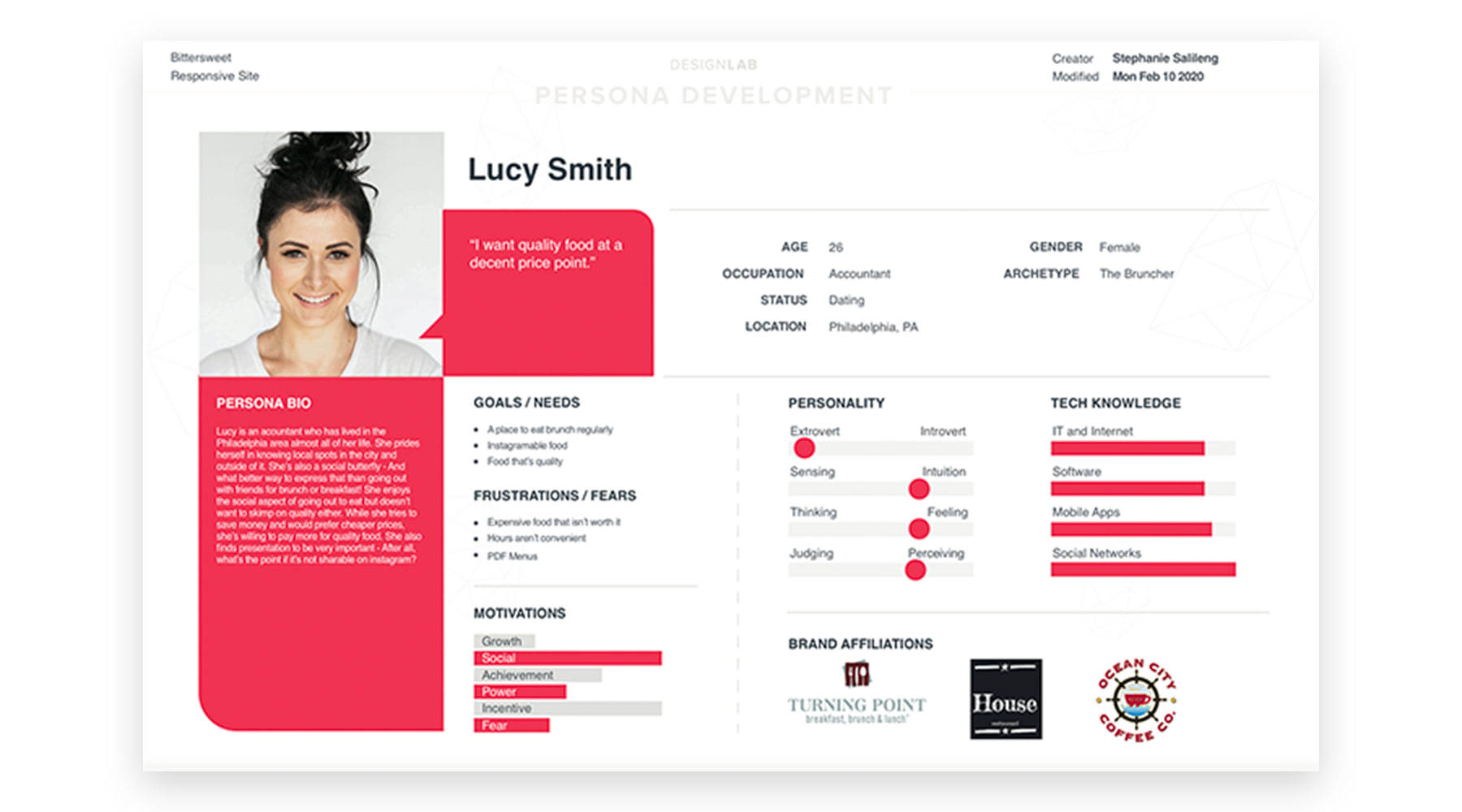
From the initial research which includes also surveys, interviews, and other methods of data collection, a full persona can be built. This is a fictional person that not only helps the designer empathize with the user, but gives the concrete foundation to build the design from.

Synthesis Phase - User + Task flows
In this case, the user flow in this particular project was the persona, "Lucy" searching for the restaurant and looking at what time it is open. It is a specific task that is more complex than the task flow - Which in this case is simply reading the menu for the restaurant.
Implementation
Because this website was built using existing assets, it was a matter of reusing them and making them cohesive together. The wireframes were built with that in mind and when the hi-fidelity comp was created, it still maintained the look and feel of the brand as a whole and cleaning it up.
Implementation Phase - Wireframes
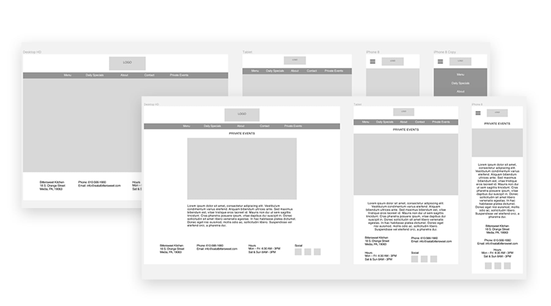
For this site, both responsive and desktop versions were needed and versioned out. It was imperative to implement an all around approach not only because people use multiple devices to access websites, but because most people have a smart phone and often use that to browse. The site in all iterations were wire-framed to give a general scope of what the site would look like in hi-fidelity.

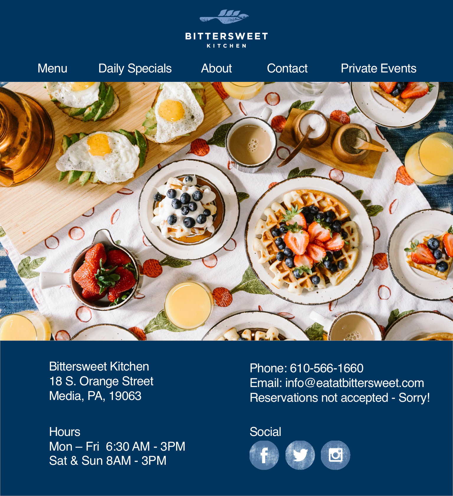


Implementation - Hi-Fidelity
Based on research and data from surveys and other form of data aggregation and collection, a website was built based on the wireframe specs, with additional features and sections added as needed. The result was a website that was not only clear, but was viewable on desktop, tablet, and mobile. From there, testing was carried out and pain points hammered out after testing was done.
Testing
Utilizing a testing website, a series of tasks were created to be completed in succession by a user utilizing a high-fidelity version of the app. Several participants of various ages and genders completed tasks at an 80% completion rate. Pain points initial design choices in terms of CTAs as well as confusion as to the initial navigation. Once the data was compiled to the test site, changes were made to reflect on that and to make a better user experience.
Next Steps
The next steps for this project would be fleshing out the functionalities of the site, addressing additional pain points and working with a developer to implement the site.
